Welcome to Camp Pickens, intrepid reader!
If you’ve made it this far, that means you followed the treasure map to the secret location… aka you read the editor’s page and clicked on the QR code. Either way, you deserve an exploration merit badge for that!
It Starts With an Idea
As a treat, here is a behind-the-scenes look at the process of how Camp Pickens came to be. First, it all starts from an idea… the Archie editorial team comes up with some quick concepts and finds the writers and artists to bring them to life. We knew we wanted a summer horror, and what better setting for that than camp? From there we polished the initial concept and honed in on the “best of” summer camp horror tropes with slashers, ghosts, and monsters. Once the idea was a go, Editor Jamie L. Rotante “scouts” for some writers who are willing to contribute to the anthology with some fantastic story ideas, in this book the three perfect for the job were Jordan Morris, Tim Seeley, and Blake Howard.
Artist Selection
From there, Art Director Vincent Lovallo seeks out the best artists stylistically for each story. We were excited to reunite the Revival team of Tim Seeley and Mike Norton for the Veronica-led slasher “Down and Out and Death Cursed.”
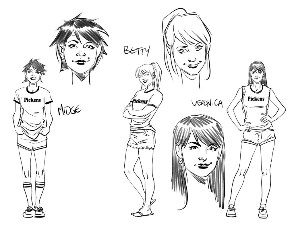
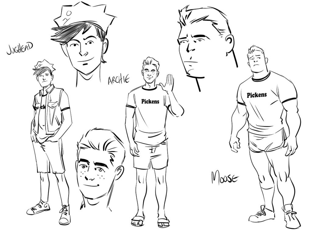
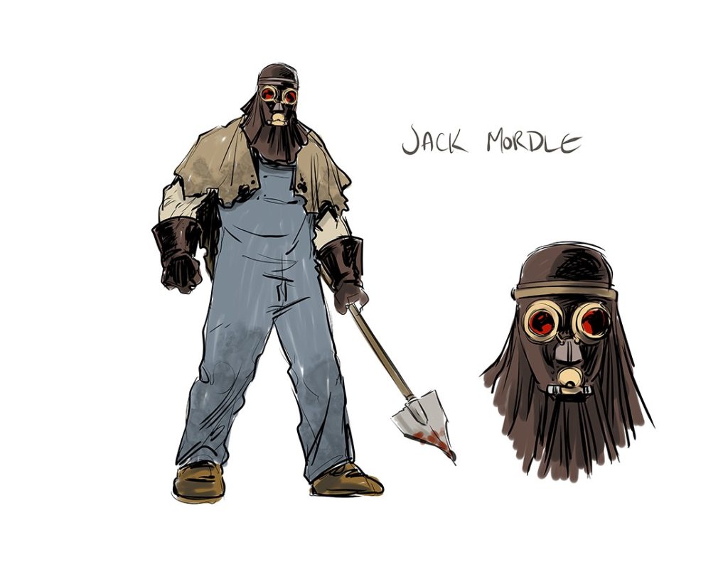
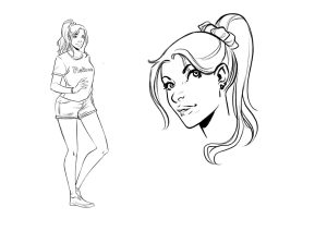
Vin also suggested working again with artist Carola Borelli, as her gorgeous teen designs were optimal for a story like “The Curse of Camp Pickens.”
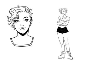
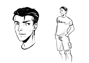
Story Framework
For how the framework story came to be, we’ll hand that off to “Bug Juice” writer Jordan Morris. Take it away, Jordan!
In addition to writing for comics, I’ve also worked in TV writers’ rooms. I love that style of creativity where everyone throws out pitches and the best ideas win. Comics can be kind of solitary in comparison, so I was thrilled that the team behind “Camp Pickens” was so collaborative! Some of my favorite stuff in “Bug Juice” came from the editors and the other writers, Tim Seeley and Blake Howard. The crew was so gracious with giving and receiving ideas. It really makes the issue feel like it’s three tales from the same world rather than just three disparate stories that happen to share a setting.
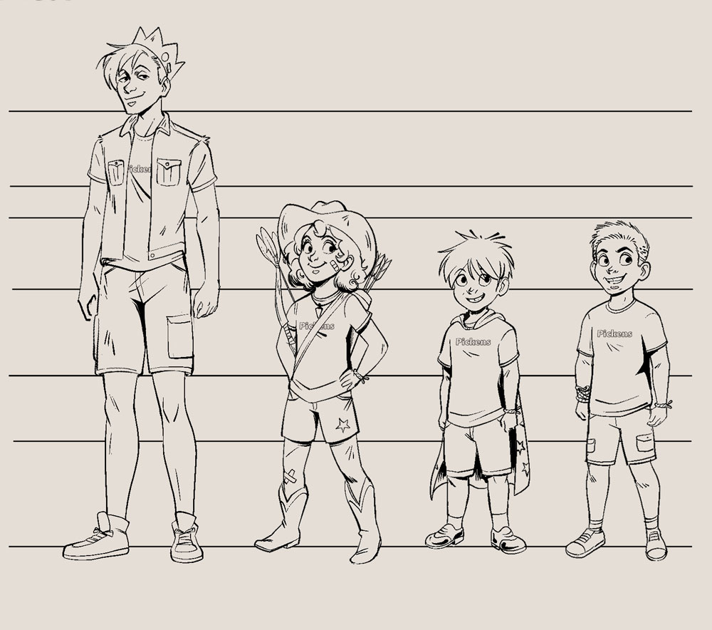
Diana Camero did a truly amazing job with the art for our story. “Bug Juice” has a real “Saturday morning cartoon but make it messed up” quality that I think her art nails perfectly. The characters are so expressive, like something you’d see on Nickelodeon in the ’90s. That makes it all the more fun when they’re staring death in the face!
We needed some kid characters for our adventure so Archie editorial suggested using Dottie, Pipsqueak, and Shrimpy. I love a li’l stinker-type character so it was fun to bring some of that precocious kid energy to Archie Horror. It was so fun learning about these classic characters, I almost feel bad for putting them through such an ordeal!
Putting the Pieces Together
And it’s all thanks to our intrepid Production Manager Stephen Oswald that you have the comic you hold in your hands today, as he keeps the train on the tracks and makes sure the book goes from just a bunch of digital files to a gorgeous print product.
Now, it would be remiss if we didn’t also mention another incredibly important aspect of comics: The covers! When Vincent is reaching out to artists, he likes to give them some ideas of the tone of the story. To accomplish this, he creates a “mood board” of similar media properties. But let’s hear about it more from Vincent himself:
As Art Director, I keep those elements in mind to create a vision board. The vision boards are arranged with artwork from comparable stories and key terms to help get the creative juices flowing and to establish the right vibe for each title. The vision board has become a key tool for us as it helps inspire our artists for both the covers and interiors as well as guiding myself and our lead designer Kari McLachlan with the creation of the logo.
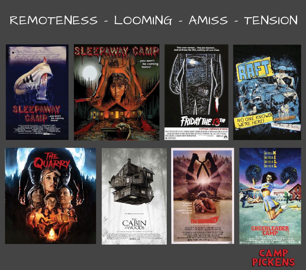
Kari then worked hard to craft a logo that both conveyed a classic camp sign along with the underlying horror that lurks just below the surface. I’d say she nailed it!
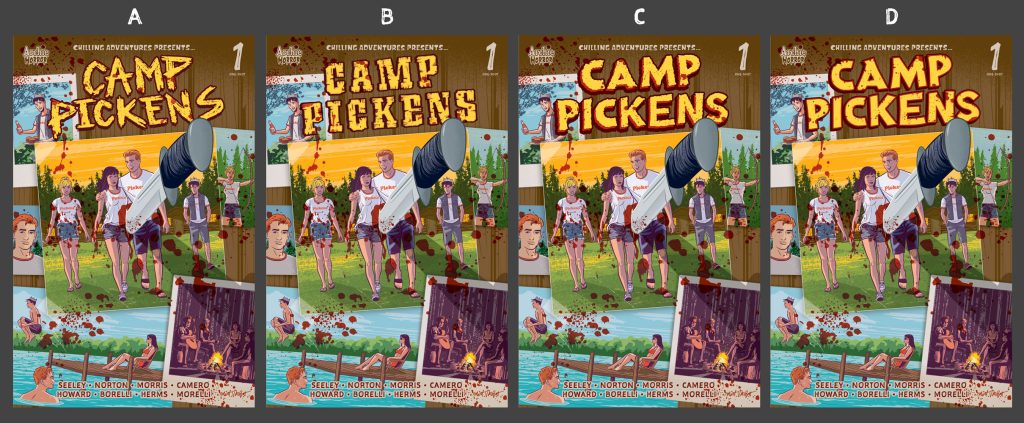
From there, we receive cover sketches, making sure that each cover is unique and appropriate for the title. Editorial has been big fans of artist Matt Talbot’s Archie-inspired classic horror covers he’s been doing on his own, and we wanted to give him a shot to create some horror art for Archie.
And for the variant cover, no one does horror art better than the master Francesco Francavilla! We’re always happy to have him on board.
We hope you enjoyed this behind-the-scenes look at how Camp Pickens came to be! Don’t forget to support your favorite haunted camp with this special, limited-edition Camp Pickens Graphic Tee.
For more writing from Jordan Morris, check out Pop’s Chock’lit Shoppe of Horrors. And to learn more about the characters featured in his story, order a copy of The Archie Encyclopedia.
Writer Tim Seeley is fantastic at crafting a story—but he’s also a skilled artist. See some of his work in The Best Archie Comic Ever.
For more camp tales (and art from Diana Camero), be sure to grab a copy of Fear the Funhouse. And to see more art from Carola Borelli, check out Betty: the Final Girl!
If you can’t wait for more Archie Horror, be sure to subscribe. And we’ll catch you next time for Strange Science, on sale in August (Click here to pre-order today!).


